Ready for a dose of jaw-dropping Parisian transformation? Picture a tired 1960s apartment and watch as a team led by Tristan Dohy, founder of Carmin, turns it into a contemporary haven with an arty twist—central living room and all. This is not your grandmother’s flat (unless your grandmother had a wild art collection and impeccable taste, that is!).
The Vision: Foundations for a Bold New Space
Carmin, an interior architecture studio established in 2016, is no stranger to making waves in France. Their work can be admired everywhere from Hôtel du Lac in Nouvelle-Aquitaine to the Séguir Eiffel Hotel in Paris and the acclaimed Rooftop restaurant in Angoulême. But their talents aren’t limited to public spaces—Carmin also brings its design magic to residential projects.
For this adventure, Tristan Dohy, a graduate of both École Boulle and Politecnico di Milano (with formative years alongside the Milanese architect Sergio Calatroni), invites us into a Parisian apartment on avenue Daumesnil in the 12th arrondissement. The flat, built in the 1960s and covering 78 m², offered a challenge and an opportunity. The new owners spotted its hidden potential, preferring it to the more expensive, wall-heavy Haussmannian style. Why? Because 1960s architecture leans on columns and beams instead of obligatory load-bearing walls—hello, creative freedom!
From Blank Slate to Personality-Filled Living
Dohy’s team began by stripping the existing layout bare. All the partitions fell, leaving only three columns and a single beam—these became the pillars (quite literally) of the new design. This blank slate approach meant the owners’ personalities, their love of interior architecture and a flair for art (their collection spans the 18th to the 20th centuries), set the tone for every decision. The teamwork? Seamless. Result: the renovation was wrapped up in a brisk three and a half months, with work commencing the day after the sale.
The Heart of the Home: A Living Area Like No Other
The clients longed for an open kitchen as part of the main living space. No problem—the old kitchen became a home office, while the new one was installed in the bright, south-facing living room overlooking the canopy of avenue Daumesnil. Being on the third floor provides a leafy, tranquil perspective, making you feel practically hidden among the branches come spring.
The kitchen was designed in two complementary parts:
- One large custom piece in white resin houses the bathroom behind it
- The second element is a shallower unit (just 50 cm deep) crafted from precious materials—oak veneer and granite—which visually lightens the space
The dining area landed between these elements, illuminated by the airy, graphic Gravity pendant by Forestier.
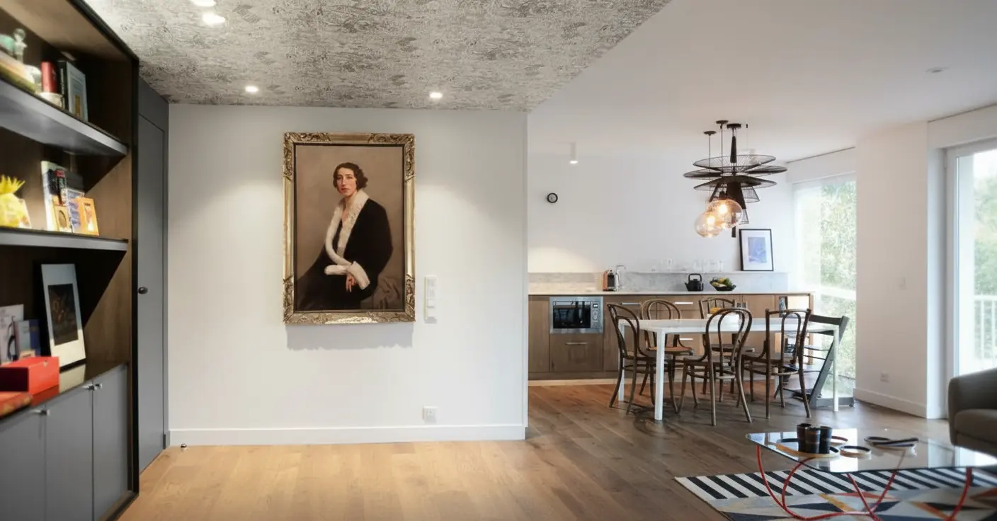
Along the windows, a low unit continues into a mobile sideboard that cleverly conceals the TV—able to roll into the room’s center for comfy viewing, thanks to floor outlets thoughtfully installed. Directly opposite, the living area features white walls and contemporary touches, like the iconic Zanotta sofa (already owned by the clients).
But there’s playful contrast too: antique family paintings mix with contemporary photographs, a wink to blending old with new. Another unique touch? The decorative entrance ceiling stretches into the living room, paired with a bespoke bookshelf lacquered in the apartment’s signature blue. This false ceiling—conceived to disguise a poorly placed beam—gives the illusion of a cornice and seamless alignment between entry and salon. Its covering? A Jean Paul Gaultier wallpaper, inspired by Japanese yakuza tattoos. Who says engineering necessities can’t spark artistry?
Cosy Bedrooms, Surprising Finishes, and the Power of Blue
Prioritizing shared living, the bedrooms were intentionally made small—each just 9 m², reinforcing their “just for sleeping” purpose. The master? Wrapped in a cocoon of deep, restful blue, with mirrored IKEA wardrobes expanding the visual space. The art mix continues: 19th-century Barbizon school painting next to contemporary photography.
In the children’s bedroom, the same volume pops with yellow details and is unified by the recurring blue, nodding back to the entrance ceiling. Here again, wallpaper with cetacean motifs from Caselio, designed from Jean Paul Gaultier’s sketches, adds a playful layer.
The new bathroom mirrors the children’s room for size and features a large shower instead of a bath, with an extra set of toilets. Here, soft pink powder tile partners with stone-effect tile, fostering a gentle ambiance.
What’s the secret sauce? It’s not just daring layouts or mixing art eras—it’s the combination of technical mastery (thank you, 1960s beams!) with vibrant interiors that have real soul. If only all “before and afters” were this refreshingly original!

Based in New York, Josh is the creative mind behind Lanco Handmade Furniture.
Passionate about timeless design and fine craftsmanship, he transforms high-quality materials into pieces that are both functional and artful.
With a keen eye for detail and a love for natural textures, Josh creates furniture meant to bring warmth, character, and lasting beauty to any space.